THE CHALLENGE
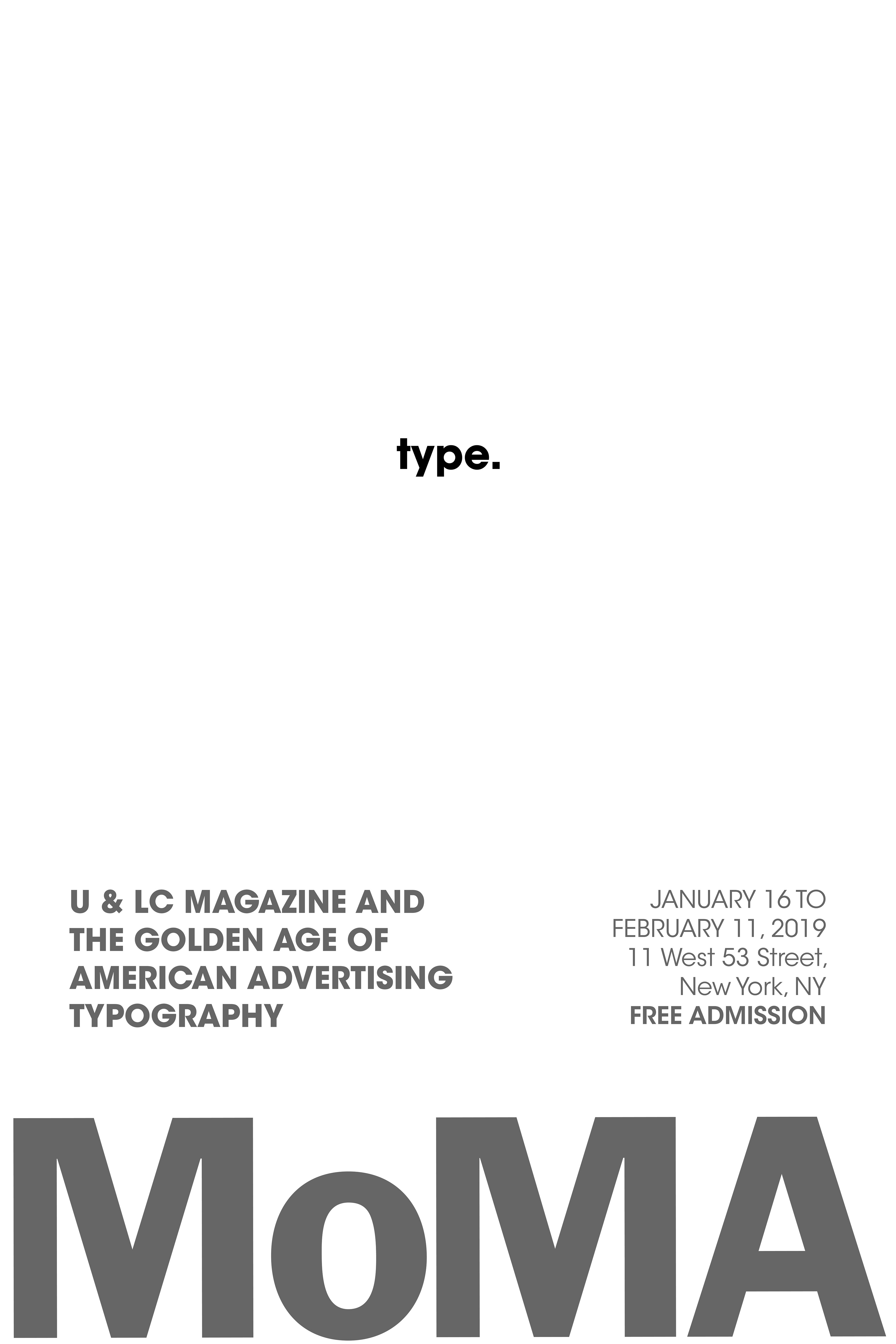
In the brief, it stated that MoMA was holding an exhibition about The Golden Age of Typography, and we were instructed to design a poster that would be posted around the city, promoting the event.
THE PROCESS
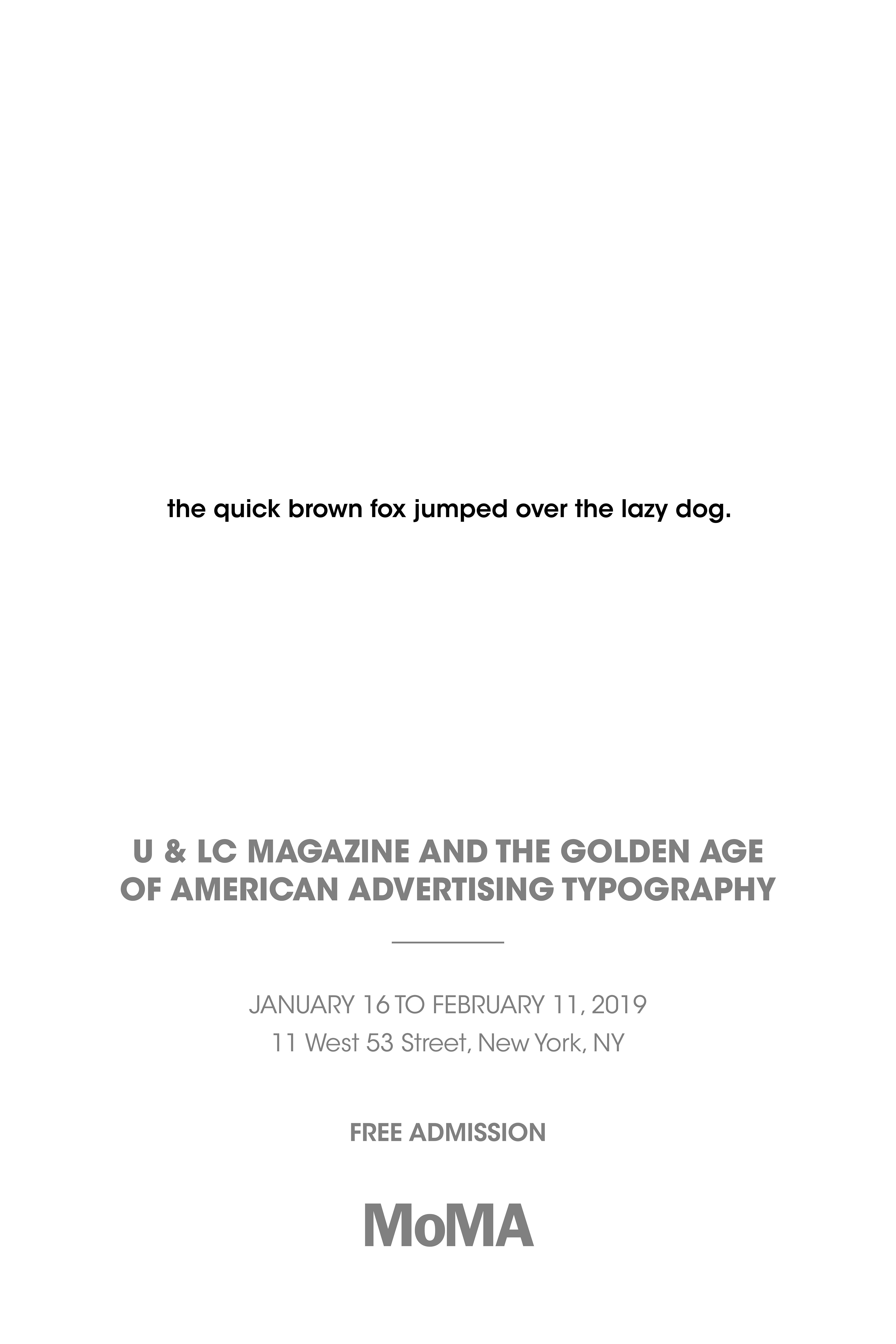
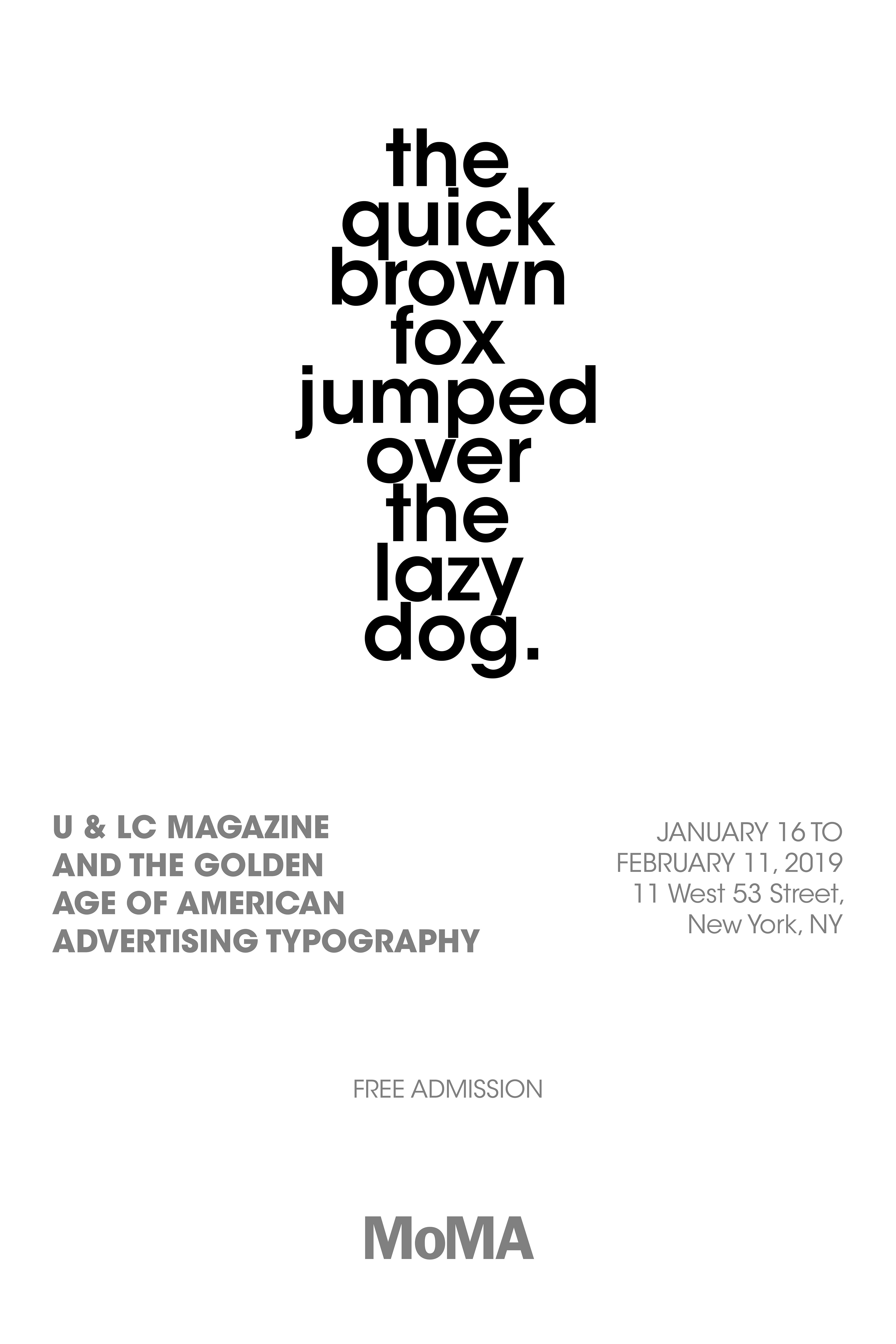
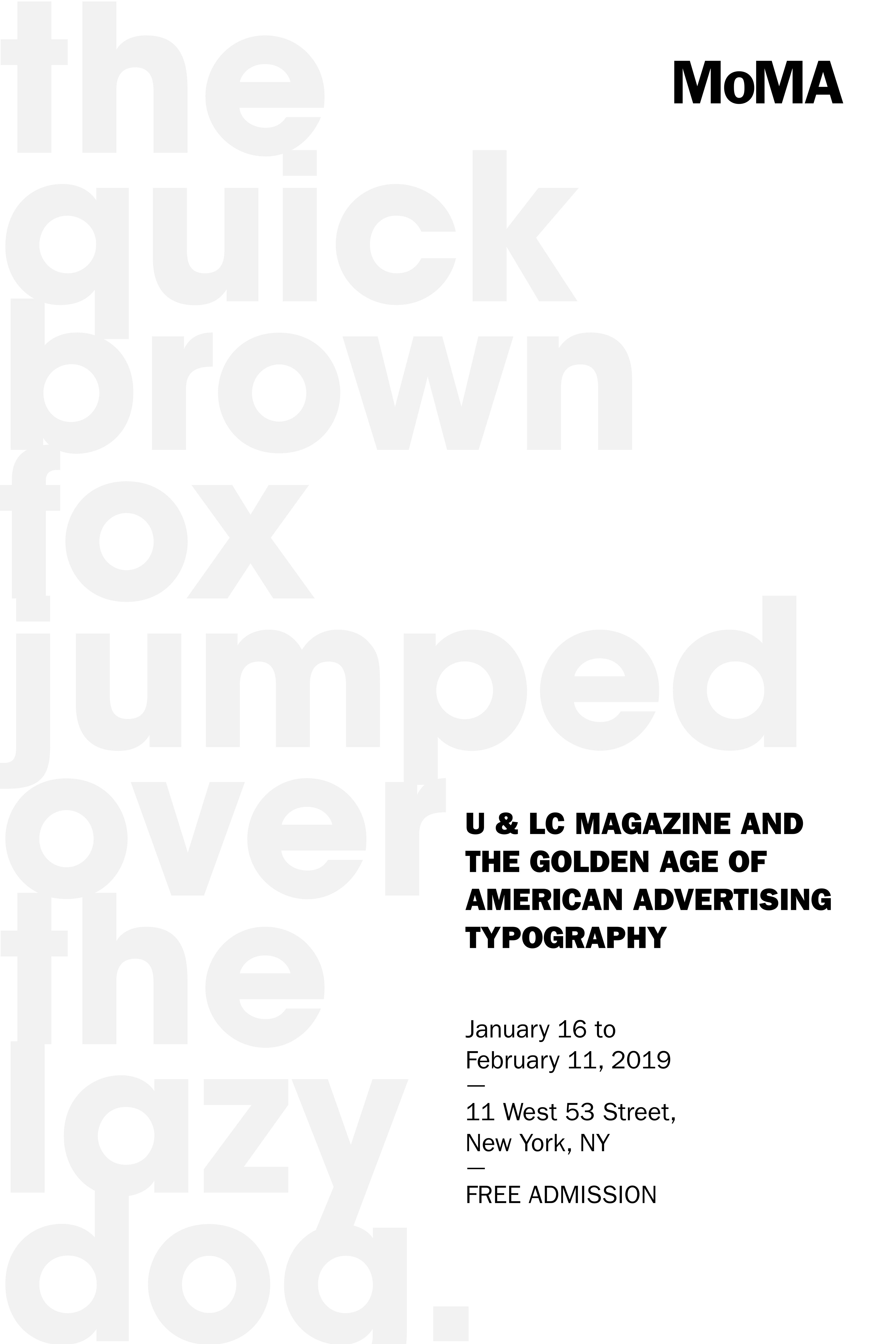
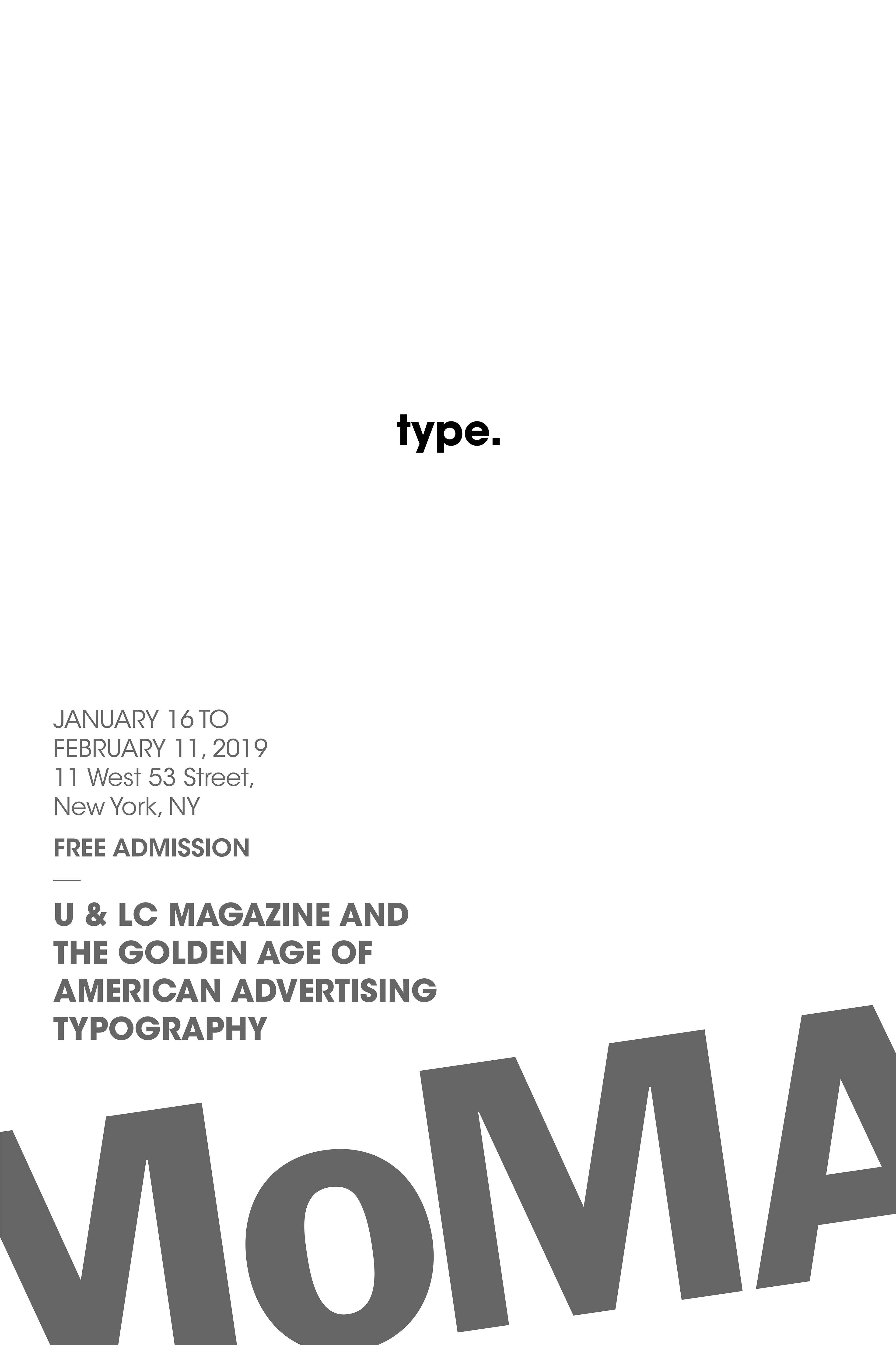
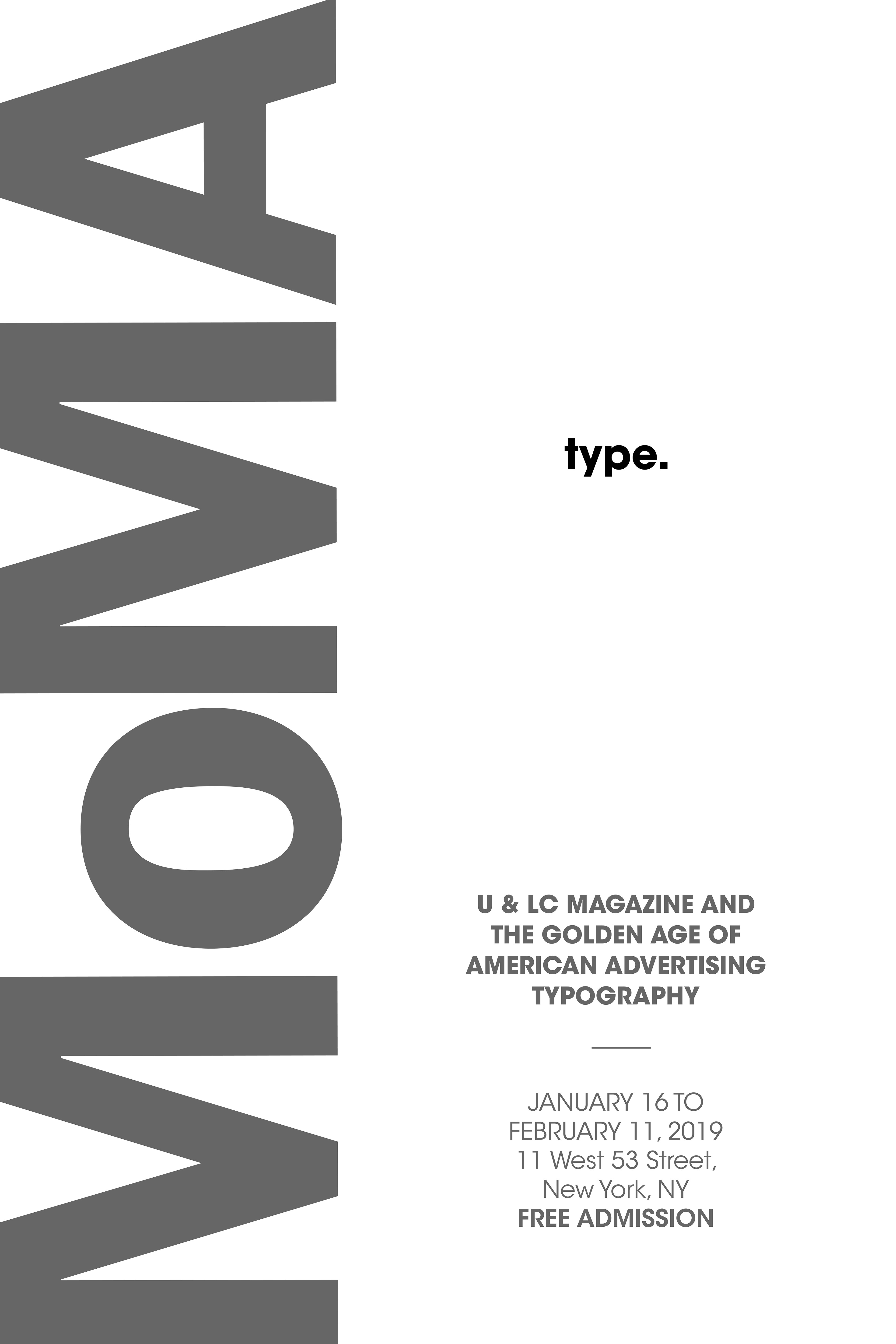
When I received this project, I immediately began sketching different layouts in my sketchbook. Based on the sketches and conducting research of the environment it will live in, I realized that I envisioned this poster to be minimal - allowing it to stand out from New York City's ephemera-filled walls. Next, I digitally rendered the posters and experimented with many different typefaces which fit the Golden Age of American Advertising. I tested the posters on different walls - some that were clean while others were very busy.
THE SOLUTION
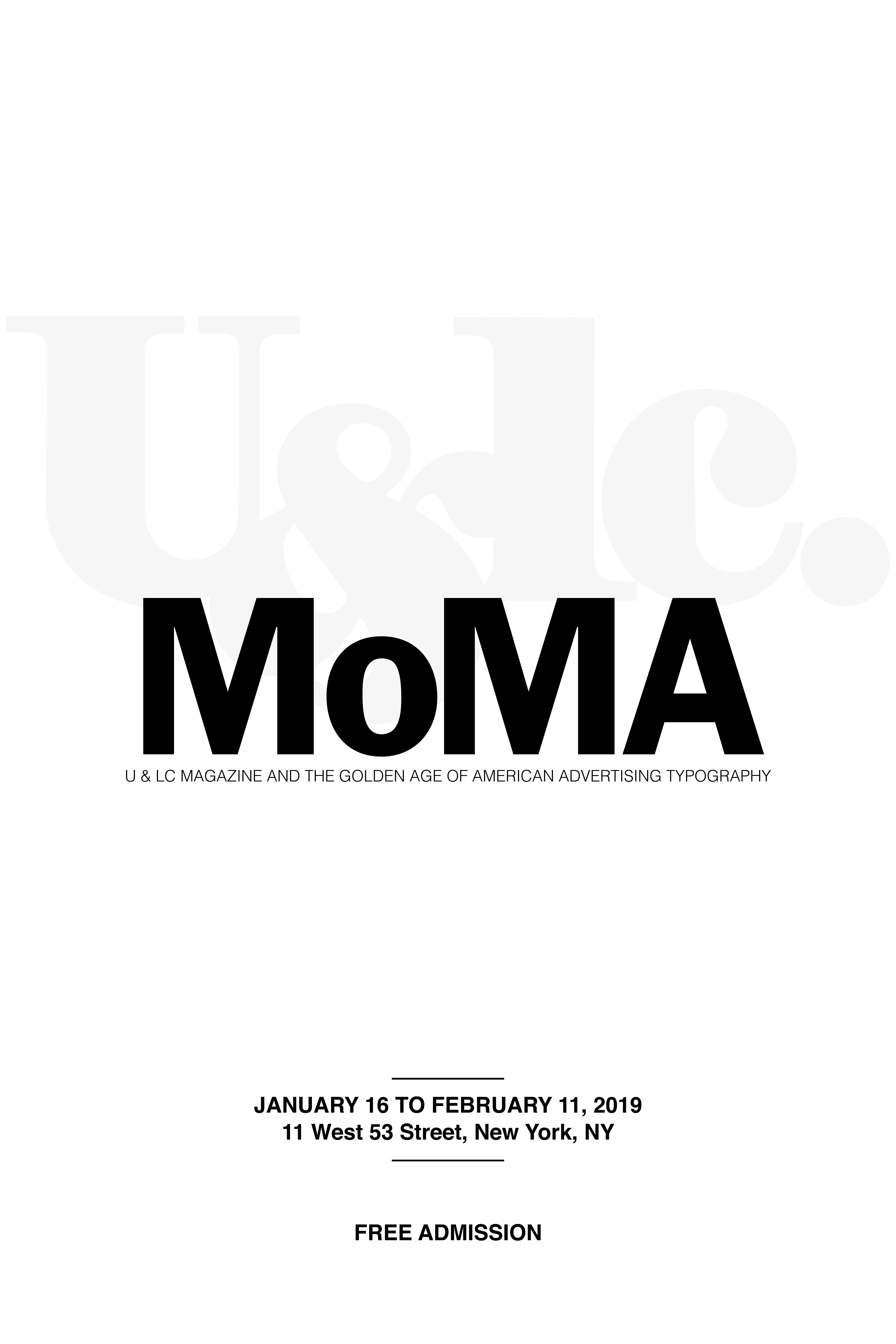
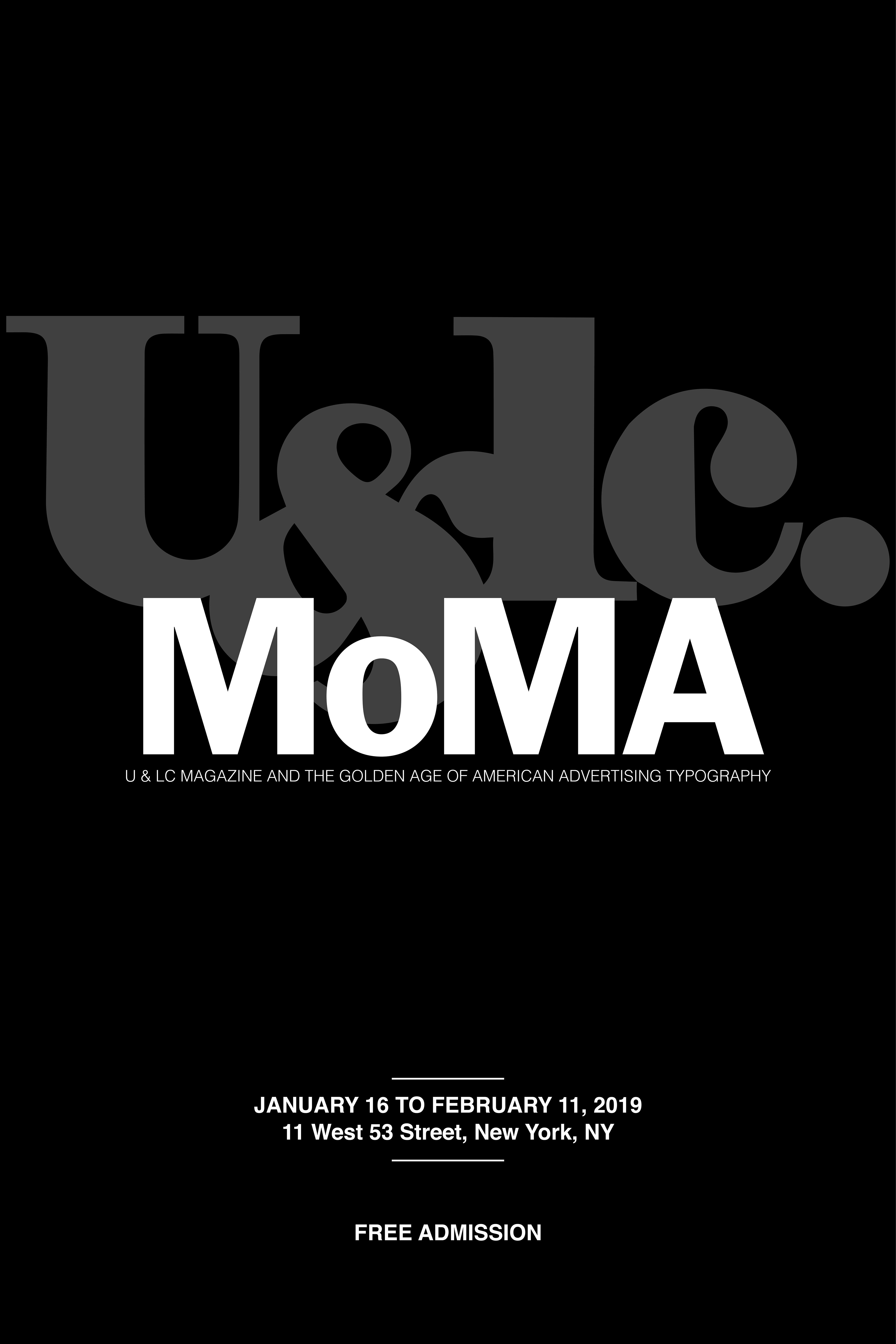
After much experimentation and research about MoMA's brand, I decided to finalize and tweak the deliverable below. This poster was most successful as it appeared fabricated when it was printed on bond paper substrate, making it eye-catching. The contrast between the typography based graphics and the information of the event also made this poster more accessible and legible.
